When we were given the opportunity and joy of creating a brand identity for a Greek boutique hotel Kali Zoi, we did hope for a lot of fun. But our experience surpassed our expectations.
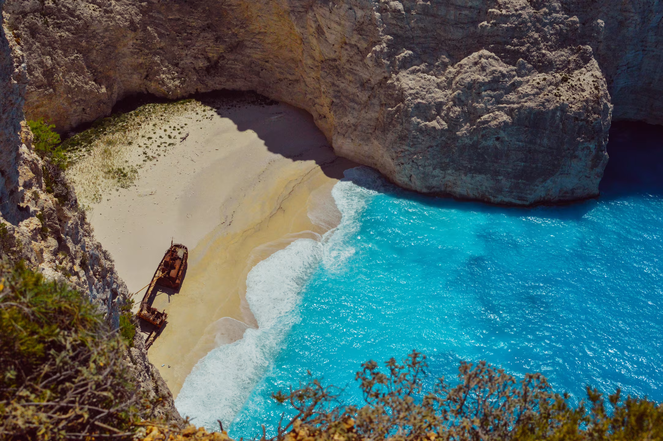
Our client, a boutique design hotel located on the famous Zakynthos island in the Ionian sea, owned by a Belgian family, is acutely aware of the trends in the travel industry. Differentiation is the key in today’s demand-driven hospitality. Booking, Airbnb, and other booking engines brought democracy into the offering, but it also made it harder for hotel owners to stand out in the ever-growing competition.
Independent hotels rely on the booking sites for reservations, but the competition is fierce. There are many up-and-coming new design and boutique hotels, backed by big hotel chains, offering good quality accommodation in attractive locations. The Kali Zoi's unique characteristics, personal approach, and beautiful setting can be easily lost at the booking site. The greatest marketing buzz is created by word of mouth and the travelers sharing their experiences directly, face to face. We want them to remember their experience and become fierce advocates of Kali Zoi for years to come.
Our first step was creating a positioning for Kali Zoi, which means „good life“ in Greek. The green, ecological, and environment-friendly holiday place, with „more than 5-star experience“ refers to a 5-star personalized treatment of guests, eco-conscious holidays which minimizes the impact on the local environment, and last but not least a dark sky with multitudes of stars visible from a hotel located away from the tourist hotspots.


We worked closely with the owner and crafted the design to fit the hotel as well as the owner's personality.
The ROOTS design concept was inspired by the structure that is in the DNA of nature - the organic shape of the roots, veins of the leaves, and structure of the tree branches. The naturally repeating structures and patterns with all their imperfections are perfect - they represent life, motion, growth, and the play of nature itself. The principle is translated into organic shapes of the brand identity - the brand mark with organic letters and curvaceous and flowing typography.
With the logo in place, we continued in creating playful and joyous elements that will create the identity of the Kali Zoi place. We wanted to creąate an immersive experience for the guests.
The hotel is a family-run business, where stray cats and dogs find refuge. This playful and heartfelt element, together with the natural richness of the island, was an inspiration for the series of illustrations and animations that capture the spirit and playfulness of the place.The design is used on the wine and oil wrapping paper and is applied on the signage at the premises.Big printed posters of the artwork hanging in the rooms and the guests can purchase the printed posters as well as postcards.
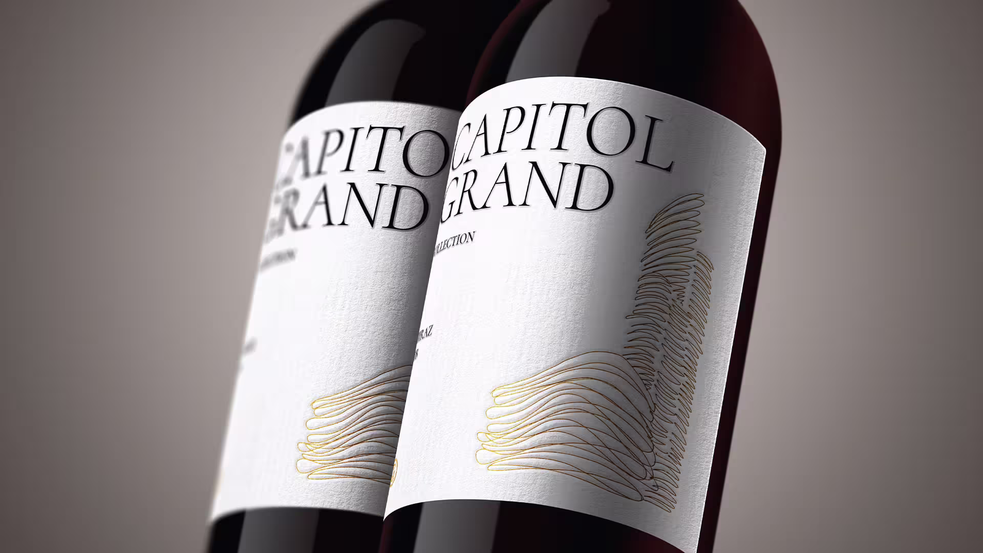
We took the opportunity to create bold design labels for olive oil and wine produced at the property to encourage guests to purchase it as a holiday reminder or as a gift for their friends and family.
Why not involve the guests in creating the experience? The illustrations are transformed into coloring books for kids and adults alike. We created stamps that the guests can use and create their own artwork, postcards, or just play while chilling at the dining table and drinking wine by the pool.