Quantox is an international software development company entering a new phase of global growth. Our task was to create a complete brand identity and website that communicate technical excellence while remaining clear, human, and approachable. We redefined the visual language to feel more confident and structured, supporting scalability across markets and services. The website was designed as a conversion-ready platform that clearly articulates expertise, culture, and value proposition, positioning Quantox as a mature and credible global tech partner.

The project started with a research phase to map and identify all the aesthetic elements that might resonate with the Quantox brand personality.
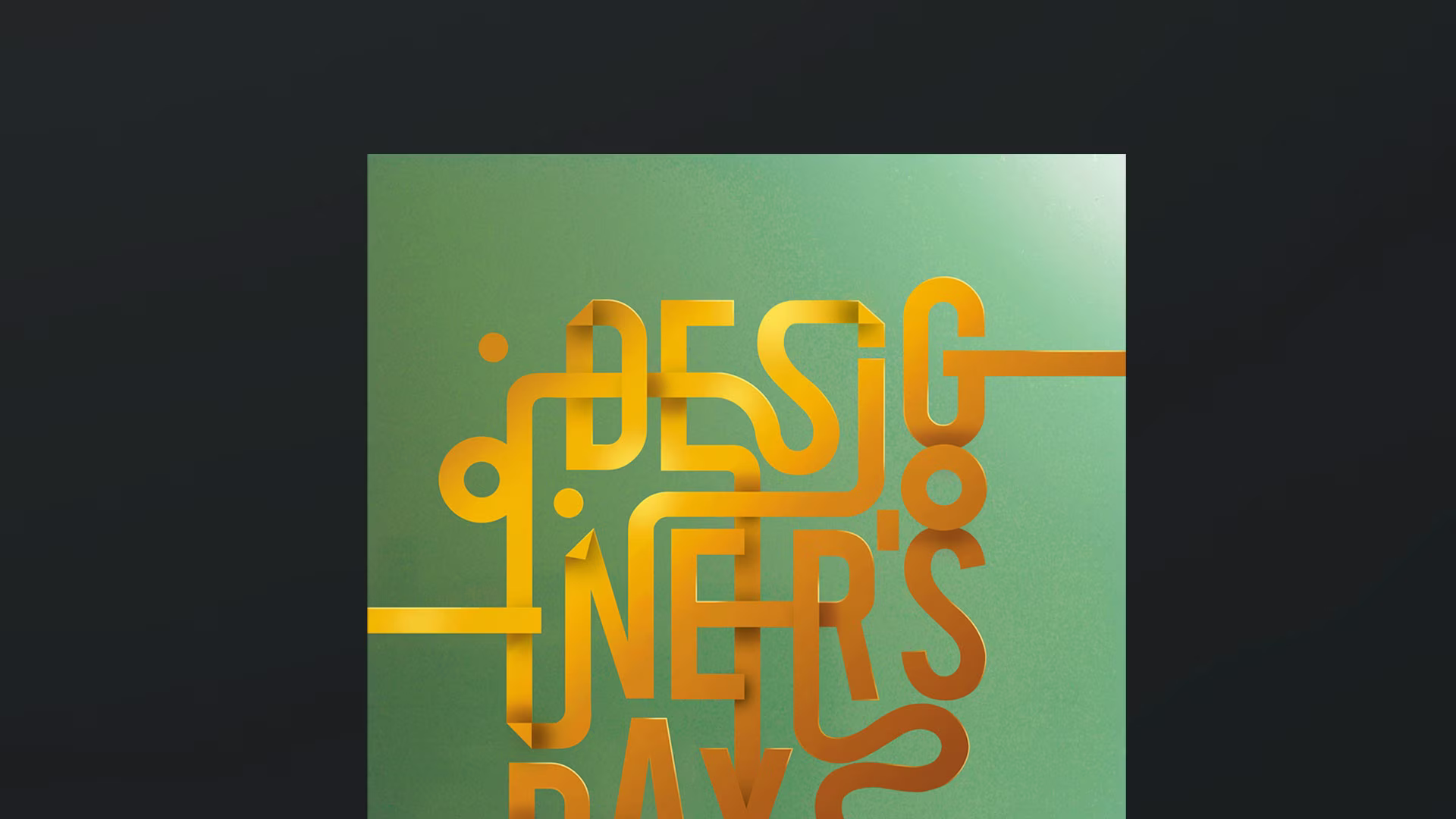
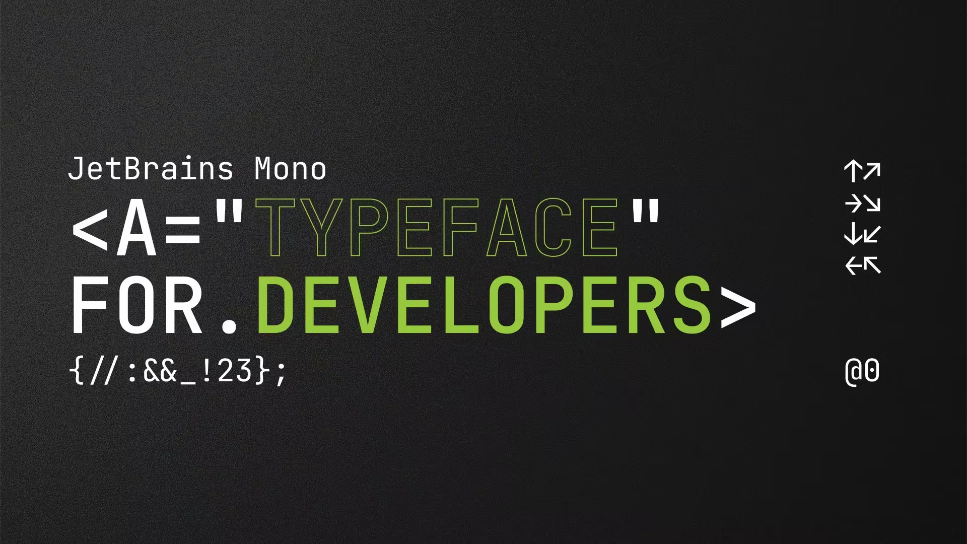
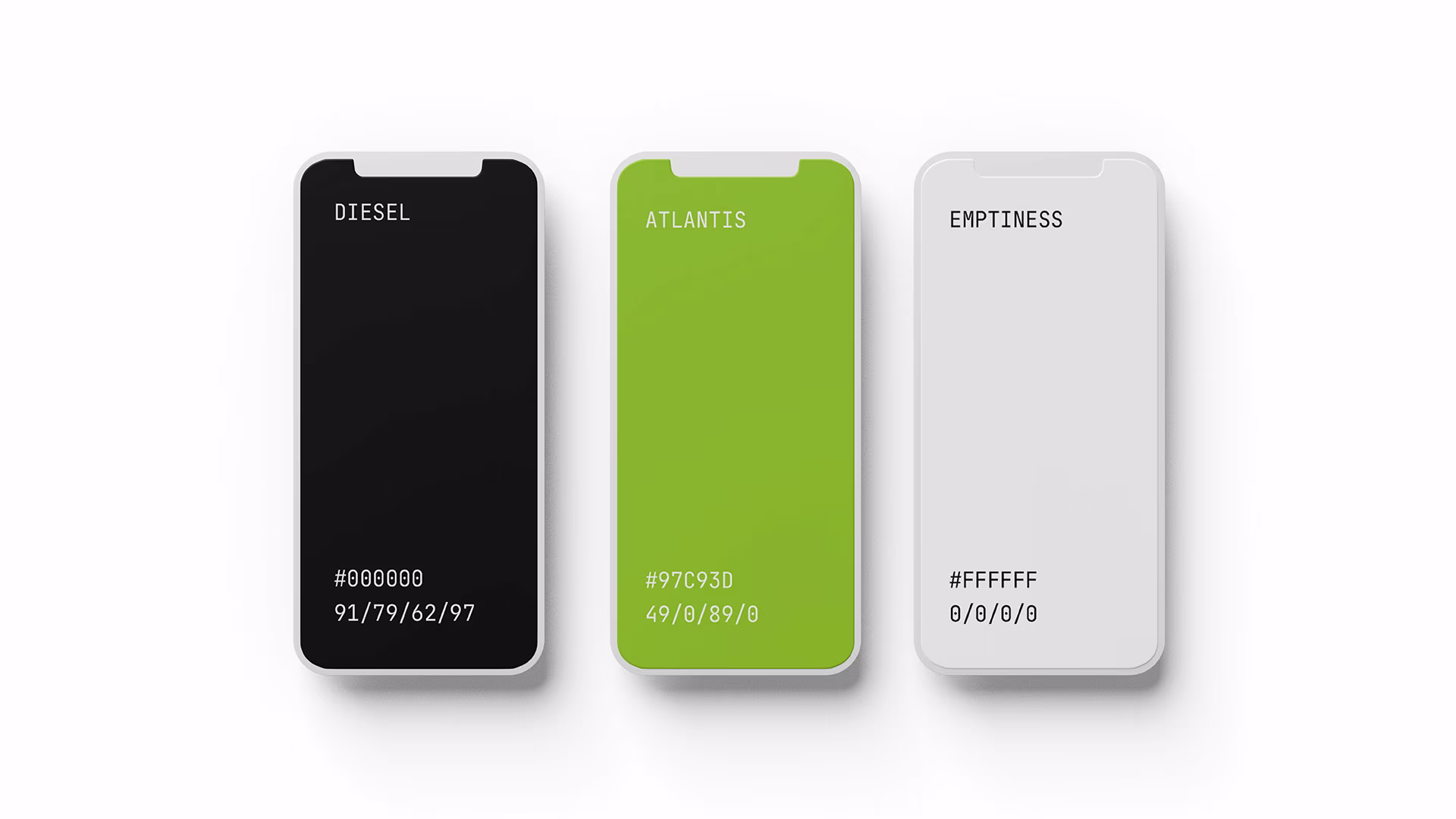
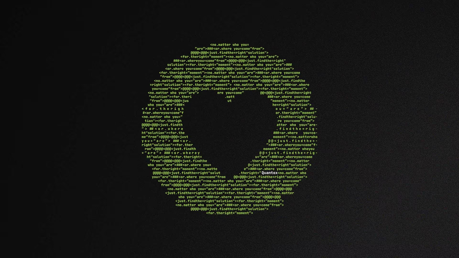
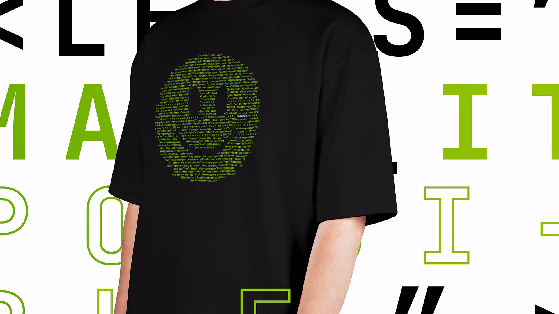
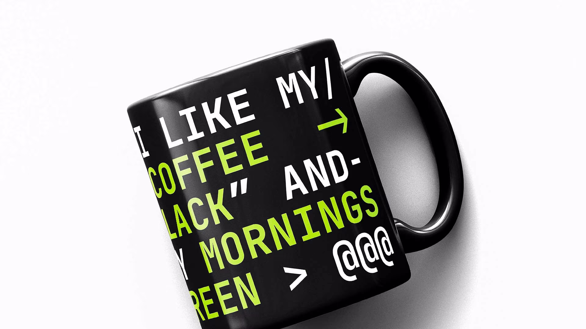
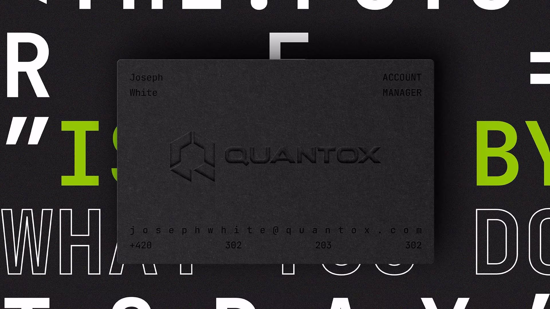
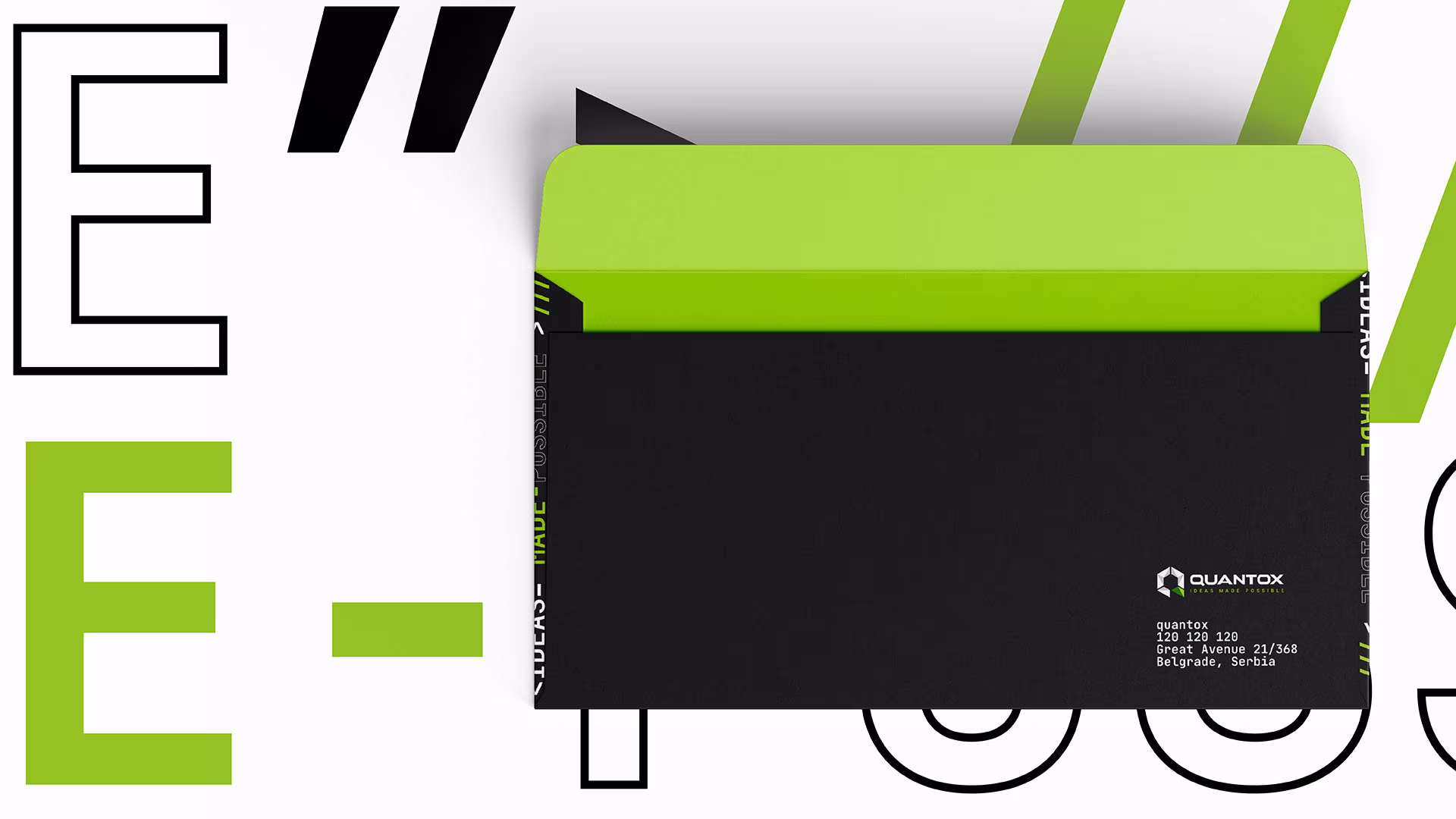
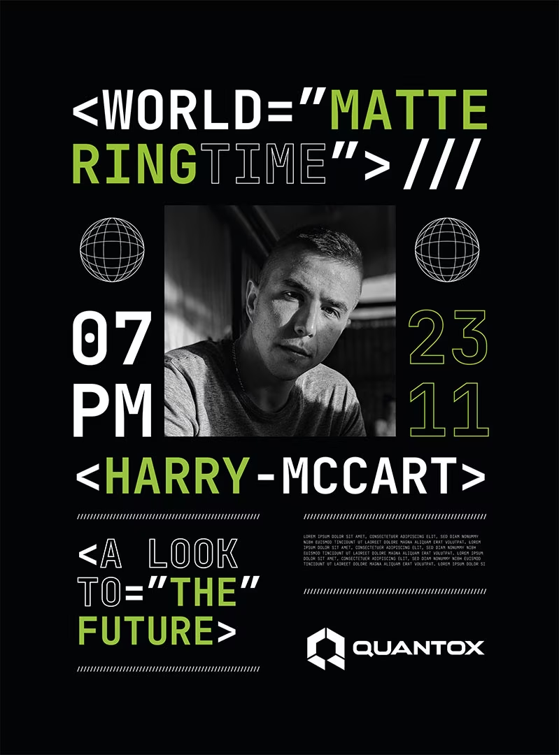
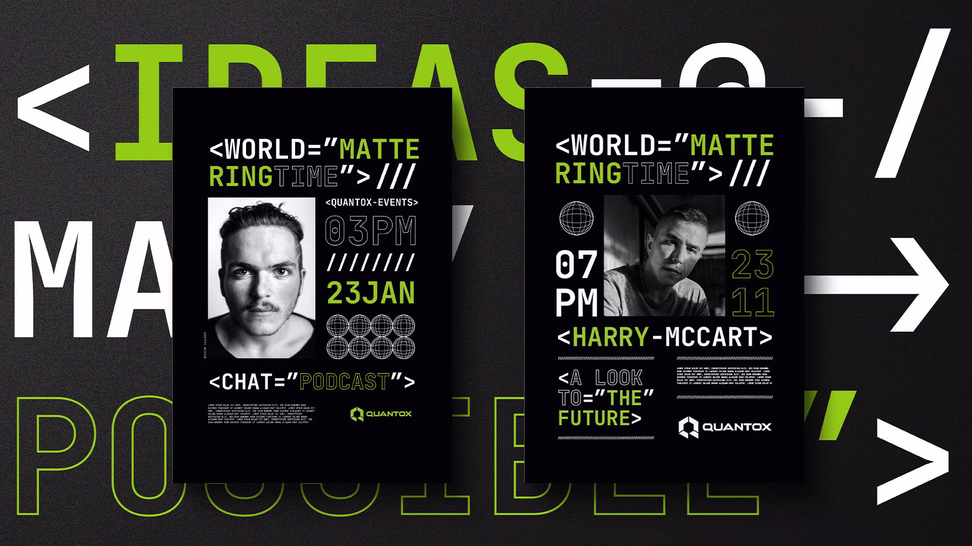
Simplifying the brand mark brought much modern tech look, and custom made logotype supported the uniqueness of the brand. Right selection of the fonts and their precise balance defined in the style guide created strong visual standard. Color was also an important graphic element. Mandatory was to use green and black and we came up with a more vibrant green and secondary palettes with all the shades.


With an evergrowing presence all across europe and looking over the pond to start business in the United States, Quantox technology approached us to design and develop a new website.
The process of coming up with a new and exiting web experience was defined by the restructuring of content and improvements to the user experience.
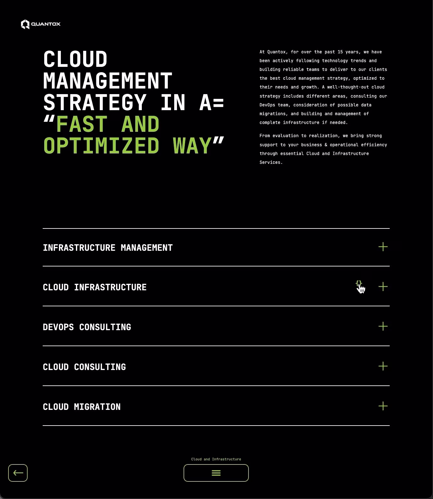
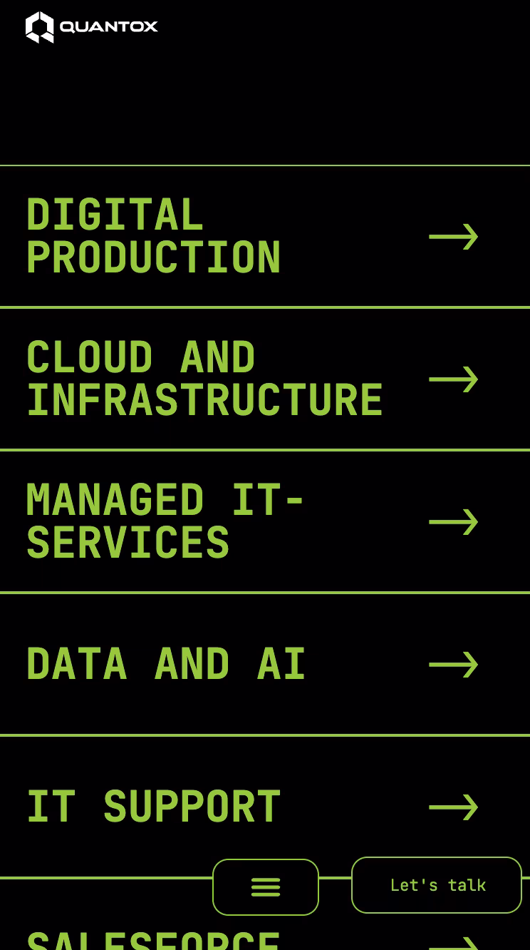
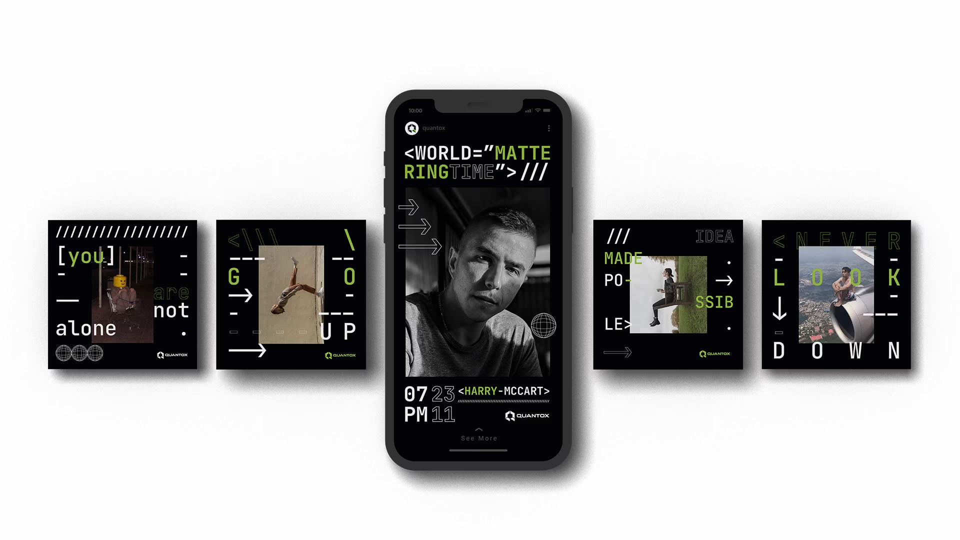
To embrace the company culture we implemented visual storytelling with horizontally scrolling sections to separate story beats without disconnecting them and dividing long content pages into digestible bites.


Quantox is a leading edge developer for applications on any device, which we decided to incorporate visually with illustrations of devices. Furthermore, to take some load off the user we compressed the content while retaining all of it through accordion and tab menus in key places, as well as animating listings to make them more engaging.